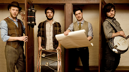
As a British Folk band, Mumford and Sons are acclaimed to have been one of the first 'West London Folk' bands to come out of the city. The contrast between their folk music and origins of an urban background synergise in a unique way to create a brand identity different to that of most other bands and artists in the music industry. Their label of a 'countrymen' band is shown clearly by the image on the right whereby the whole band is pictured in sophisticated clothing that somewhat resembles their down to earth and chilled way of life. Alternatively, the background of the image on the right shows a range of people of all ages partying in an excited and chaotic manner. This is symbolic of the band's actual music in the way that it is fast paced, energetic and chaotic too.
As well as their clothing and album covers, the band is also subject to a clear brand identity in different ways. For example, the name of the band 'Mumford and Sons' provides multiple connotations. First of all, the fact that the band's name starts with the lead singer's last name, Max Mumford, suggests that he is perhaps one of the main points of the band. Unlike bands such as Oasis and The Arctic Monkeys that have abundant lead men, However, the fact that Mumford and Sons use Max's last name in the band name gives the impression that they are an alternative band who seek to appear differently in the public eye.

The album cover to the right further suggests that the band are appealing to a range of audience, not just those primarily interested in folk. This is evident through the use of several different flags in the background that symbolise that the band can be from different walks of life but still be able to unite and create the music people enjoy.